Introduction Statement

Hello designers,

my name is Katie Rohrbach of Katie Rohrbach Interiors. Ever since I was about seven years old I have been designing interior and exterior spaces. I still hold onto some of the interior space drawings from way back then. My passion for design continued to grow as time passed by. After graduating high school I attended Bellevue College studying photography, art and design for about two years until I transferred to Washington State University to study interior design. Currently I am enrolled at Washington State University as a freshman in the summer program. This opportunity to study at Washington State University means everything to me and I will tell you why. When I was sixteen years old I had a grand mal seizure at one of my friends birthday parties and landed onto a glass/hardwood coffee table. Ever since that fall I have never quite been the same… the fall caused memory loss to come and go with each passing day since the accident. Four years later and I still struggle with remembering how to do certain activities or what I am supposed to do. The one thing that this accident can’t take away from me is my ability to design and create. Although I will have this ‘handicap’ the rest of my life I will always be able to do what I love; design and create. The world around me inspires my designs and I put everything I have into a project no matter how small. I will continue to expand on my understanding and elements in the Interior Design industry on my road to my future career as an Interior designer.

Monday, October 8, 2012

Urban Sketchers

During our time at Sculpture park in Seattle, Washington we had the chance to sketch with the Urban Sketchers of Seattle. We practiced and relearned sketching exactly what you see and using your pen/penicl to measure and mark on your paper the points needed in order to create a great sketch.

I consider the below sketches to be successful due to the detail and accuracy of them.

I realized my weakness is in my patience and once I do something wrong I also have the need to erase or start over instead of continuing through with the drawing.

My strength is in my technique and strokes with my shaky hands.


See below examples

Job Shadow - Starbucks

Since my job shadow did not want us taking pictures during the day as we were shown secret trades of Starbucks I will not be including pictures /sketches in this post to protect their rights as a company. Much respect for Starbucks. After getting off at the wrong stop at the light rail the day was off to a rocky start. But our guide was very understanding and gave of the gist of what we had missed and sent us straight to a tea tasting of a new tea that will be coming out in November and trust me it is to die for, but I degress.
We learned that knowing / learning how to do sketches, and bascially everything by hand is quite a useful skill to have and that we need to keep up the good work.  Knowing computer programs such as sketch up, revit, CAD ,etc is mainly what we will need to be proficient in in order to work well as a design.
We learned alot about the history of Starbucks and went out to the lunch with our guides as well.
Those were mainly the skills we focused on as well as the information they were trying to get across in order to help us in becoming designers.

Kitchen Project
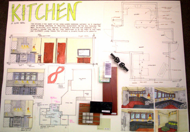
For the kitchen project I used my inspiration from my concept development post to inspire this floor plan, the materials and the overall feel to my space.


 One of my favorite things about this project is the fact that I incorporated my concept model/parti into not only the flow between the rooms in a motion pattern but with this handle that I found for my cabinetry.
From this project I learned that I need to seek out help when I need it and keep up the good work. Also if things go missing I need to report it right away. I also Need to remember to add in all of my lighting plans and cross check everything with one another so that it all makes sense.
The bathroom project will be much better.

Showrooms

Our trip to Seattle was well worth the journey. We got to bond with one another while staying at the Roosevelt Hotel and while going to different appointments with different companies and firms. We dressed in professional attire and constantly inquired about the companies and manufactured products, etc. Our group started out by departing from Pullman Washington- small country town and headed out towards the big city of Seattle, Washington. Its about a six hour drive without complications... well with a bus full of 41 giggly girls and 4 men things didn't go according to plan. The bus broke down about 6 feet from the top of the pass - over heated engine. While we worked on fixing the engine our friends in the landscape classes passed us in their caravans. Eventually we got up and moving and stopped for lunch in Issaquah where we switched buses and tried to stay on schedule. 
Arriving in the Seattle Design Showroom district we took a tour of SDC (see group photo below). We were allowed to see some materials rooms and were told we would be getting some free samples. Who doesn't love free samples of fabric!? We also received free wrapping paper samples. These will be used for Christmas this year. It was great to get to touch and see all of the materials, furniture and everything they had to showcase. I really enjoyed the furniture rooms where they had treated their wood pieces in a different way then other stores. They did a number of finishes, treatments, etc to get the wood just perfect. I would describe it as looking into the wood rather then looking at it. 
Next we walked to the Daltile showroom where we experienced a lot of tile work. We registered for a lot of free samples which are being shipped to us. This will aid in helping us with our kitchen and bathroom projects that we are currently working on. Right now I am focusing on sustainable materials but I have room for some different materials from Daltile. The samples from Daltile are beautiful and I can't wait to see them again. After Daltile we visited Pental where we got to explore another showroom which was just as exciting as Daltile. Pentel had some wonderful bathroom/ room setups that we could see the materials physically being used in. It was truly an outstanding visual- to be able to see the sample splotch on an actual surface made visually other samples on surfaces easier. 
-END OF DAY ONE-

-DAY 2-

On day two our two groups went our separate ways again -Group B (my group) walked to the Knoll showroom on 5th avenue. We were given a grand tour of the showroom and got to see all the chairs. Some of the classics were there such as the Womb chair, Wassily chair, Bird chair, Tulip chair, Diamond chair, etc. We were able to see their office space designs and new innovative designs for compact office cubicles as well as their transforming office chairs. The transforming office chairs conform to the person basically. If you are a 6'5" man you can accommodate yourself  in the chair by simple raising the chair and pulling the seat out farther and pulling the arm rests out. The backing is made of a breathable material that is strong and durable. I strongly believe that Washington States School of Design and Construction should invest in these classic chairs. We then sketched chairs for the remainder of our time there. Next we caught a bus ride to 3 Form. 
3 Form is one of my favorite materials- ever since I was introduced to it during summer session I have used it in all of my projects. 3 Form is made of an eco-resin which makes it easy to clean off of, bend, use as lighting, and easy to create almost anything out of it. The 3 Form showroom we visited dealt primarily with lighting but they did say that they could make anything imaginable. 


Concept Development

Concept Development

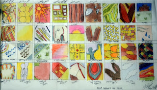
For my concept development I started doing 2d abstractions [parti's] which evolved into a final parti and from there I created concept models and space study models.

On the above parti's I focused on the use of color. I used the song Amarillo Sky for inspiration for my project that will continue to be my inspiration for the kitchen, bathroom, living rooms, etc. for the one bed room two bedroom and common space.


The partis in the second sheet that I made were done in black white to focus on the elements used to design them rather then emphasize them with the use of color. the final parti i chose is done in red to show the warmth of family and is an abstraction inspired by the infinity sign. Family is forever.

 The next four photos show the concept model I developed from the final parti (above). I left it in white due to the fact that I wanted to keep it open minded so people could intrepret it however they pleased.


I used the flowly element that the client wanted and focused on openness while still relating it to my concept model through the use of flow and connectivness. These are two different floor plans that I came up with. I hope to find a better fitting floor plan after I do the wheelchair exercise. It could change my whole design potentially.


Ride Don't Walk


I participated in ride don’t walk as participant number one. First I got into the elevator in Carpenter and went to the second floor bathroom. This normally simple task turned into a huge effort to open the door and squeeze the wheel chair past. Once inside the bathroom I was unable to enter the handicap stall with the bigger wheelchair due to the corner right in front of the bathroom door. I proceed to the sink where I had to stretch very far in order to get to the sink and then came the awkward wrist angle of pumping the soap. This bathroom may have said it was handicap accessible but it clearly was not made for everyone. Honestly if I had been badly injured and was in a wheelchair I would have had peed my pants due to the simple fact that I would not be able to get into a bathroom stall let alone sit on the toilet.
I felt that this assignment was very well thought out and very beneficial to all that participated. It truly got me to think about how things were angled and oriented in the room so that anyone could use it and access it. The fact that we had to do this assignment during our kitchen project and upcoming bathroom project really made me feel like I had to go back through my layouts and change things around. I rethought the majority of my designs and am planning on redoing my layouts continued by perspectives to scale to really allow myself to walk through the space I’m creating.  
The small spaces are great for saving money and using every inch possible of the space we pay for especially in a hard economy. Using sustainable materials, transforming old buildings… whatever it is we need to make sure it is accessible to all kinds of people no matter the height, limitations, and x-variables which ever it may be it needs to be inclusive.
I struggled with the fact that I had to control myself as I rolled downhill out of control and work hard to get up a hill. I’ve been in wheelchairs before but it was usually post-surgery and other people took care of me. It took me twice as long to get to the same place as everyone else who was not in a wheelchair. I struggled to get through doorways, opening and closing doors, cub boards, etc. Picking things up and carrying things were difficult and took me awhile to get used to.  Everything felt as if it was inaccessible and the things people normally take for granted were seemingly impossible.
Knowing that everyone else could do the things I struggled with pushed me to continue as always but it still would have been nice if the things that are claimed to be handicap accessible were actually just that- accessible.