Introduction Statement

Hello designers,

my name is Katie Rohrbach of Katie Rohrbach Interiors. Ever since I was about seven years old I have been designing interior and exterior spaces. I still hold onto some of the interior space drawings from way back then. My passion for design continued to grow as time passed by. After graduating high school I attended Bellevue College studying photography, art and design for about two years until I transferred to Washington State University to study interior design. Currently I am enrolled at Washington State University as a freshman in the summer program. This opportunity to study at Washington State University means everything to me and I will tell you why. When I was sixteen years old I had a grand mal seizure at one of my friends birthday parties and landed onto a glass/hardwood coffee table. Ever since that fall I have never quite been the same… the fall caused memory loss to come and go with each passing day since the accident. Four years later and I still struggle with remembering how to do certain activities or what I am supposed to do. The one thing that this accident can’t take away from me is my ability to design and create. Although I will have this ‘handicap’ the rest of my life I will always be able to do what I love; design and create. The world around me inspires my designs and I put everything I have into a project no matter how small. I will continue to expand on my understanding and elements in the Interior Design industry on my road to my future career as an Interior designer.

Showing posts with label Sketchs. Show all posts

Sunday, July 15, 2012

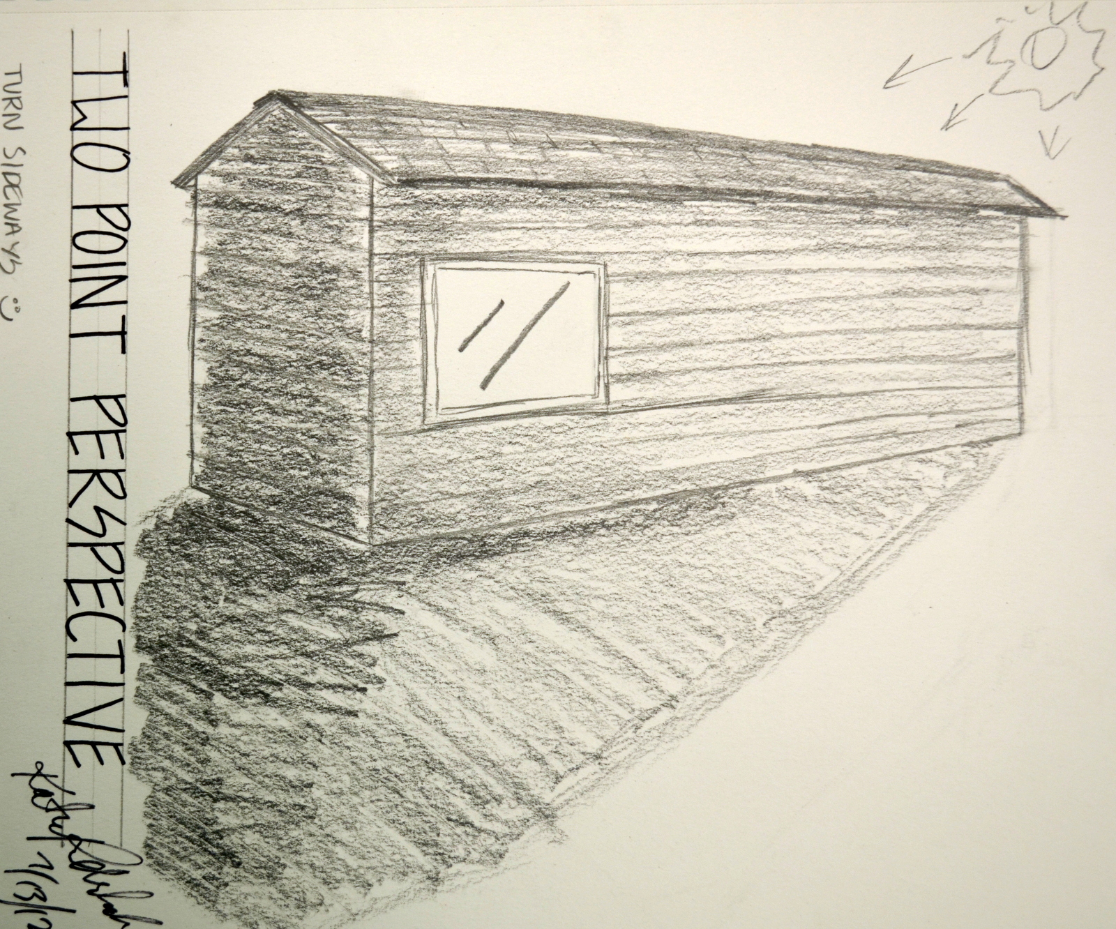
2pt Perspective

To practice two point perspectives I found this old house that was about to be torn down in Viola Idaho. I drew this using graphite pencils of different line weights. Being able to practice the two point perspective was fun but it proved to be difficult. The angles and I just didn't seem to agree 100 % of the time. I guess I just need more practice.

In the Corner

This was a sketch I did to practice my ability to use my pencil to help draft out a room. This one came out a lot better then the red building [one point perspective] that I did. I also practiced using shades and shadow in this one measuring everything to scale how I saw it. I chose to the brick walls and the windows in order to challenge myself to get all the lines correct. The windows are all blocked out so there was no natural light source coming into the room through that window. The carpet is very finely woven so all I really did was texture it through graphite.

Exterior 1pt

This exterior sketch done in colored pencil and black ink flair pen uses one point perspective. It was hard for me to do since I was not allowed to go closer (closed off for construction). I did this sketch to practice my ability to do one point perspectives. I definitely have room for improvement. I just have to keep on practicing. I used my pencil to take measurements - which is a useful skill to have in drawing. I haven't been using it for a long time only about 5 years off and on so I definitely need to keep practicing with it.

Two Rooms

For this sketch I wanted to show the difference between the use of just lines and then the use of lines with shade and shadows. The first sketch on the left shows just lines while the one of the right shows the use of lines with shade and shadows. The first drawing was done using a black flair pen while the second drawing was done using black flair pen. I struggled to do this freehand with no rulers because I have shaky hands due to surgeries but I still think these turned out well. I emphasized the negative space in the first sketch and in the second sketch I emphasized shading and shadows.

The Fabulous Chair

This complete series of my chair in the dining hall at University of Idaho was to help me gain personal experience with different view points of this fabulous chair. I took the chair and did a perspective drawing, side, front, underneath, above, and pattern view of this chair. I practiced my measuring skills and rounding to a half inch. Being able to draw and sketch is a skill I feel designers should constantly be keeping up on hence all these sketches. I was also able to practice my measuring skills, which as a designer you constantly need to be on your toes about.

Napkin Art

"Napkin Sketch"

Since I ran out of paper I decided to draft out a floor plan and a perspective drawing of my new dorm room for everyone to see. It's freehand drawn to scale or close to it in a black ink flair pen. My dorm is located in McEachern Hall North on the Washington State University campus. By doing these drawings on a napkin I came across some obstacles, such as ink bleeding thus distorting the image I was trying to create. Writing on napkin material proved to be very difficult. This napkin was more of a paper towel type texture with lots of bumps and absorbancy. I tried several brands of napkins ranging from cloth to paper napkins. There are so many paper napkins out there in the world but I finally settled on the paper towel type napkin since it proved to bleed less than the ones I previously tried. Now that I have gotten the experience of napkin drawing under my belt my lines on flat paper have become steadier and more streamline.

Monday, July 2, 2012

Tri- Fruit

I call this piece Tri- Fruit since I did a value painting of three pieces of fruit; pear, apple and orange with flair pen ink. I mixed the appropriate shades in tints, tones and values  in order to show the scene I saw in front of me.  I captured the correct values and tones of each piece of fruit to a 'T.' After the paint had dried I sketched over the important lines for contour drawings in each piece of fruit to emphasis the lines I felt would be strong. Overall I feel successful with this piece and look forward to doing another just like it.

Stairway to Heaven


This was a shadow analysis I decided to do using a staircase and its railings. This sketch was done around 5:30 am near McEachern Hall, Pullman, WA. In the first sketch you will notice the subject matter and the shadows it's creating. The second sketch shows red lines indicating the figures that are creating shadows. The parallel and perpendicular red marks indicate what part of the shadow the line is coming from; either a parallel line or perpendicular line. Most of the lines in this case study were parallel lines as the sun was casting a short shadow on the railings.

Inverse Leaves

For this sketch I took a photo of a leafy stemmed plant and created the outline of the plant with light lines and continued to fill in the spaces I created minus the leafy part. This created an image of the shape of the subject matter with no detail to help with the identification of its origin. the positive and negative shape I created can now be interpreted as almost anything! I love it.

Getting into Shape

Using a black flair pen I created this contour sketch of a man running on the beach. The original photo is posted above for reference. I simplified the image into the basic essential lines using no shading what-so-ever. There is still room for improvement in my pen-men-ship and free hand drafted lettering.

Talking Trees

While on a stroll through campus I came across these two very different trees and decided to sketch them One bares leaves while the other has pine needles. I decided to do somewhat detailed sketches in graphite placing the trees next to each other on the same page. I focused on using semi- contour lines on the first tree [left] and using more detail on the second tree [right]. If I had had more time that day to sketch I believe I would have done a much better job.

Tissue Please

Using contour lines with gradation and values I drew a picture of my left hand holding a tissue. Since the tissue was white and smooth there wasn't much room for detail other than shading which I correctly visually identified and recorded in my sketch.


Lines

Using the main lines of different artists in the first four boxes I tried to duplicate their lines. Such artists include Picasso. In the fifth box I did my own sketch using what ever style of lines I wanted -- my own style of any object of my choosing. In this case I chose a safety pin where I used simple lines and shading for the pin and cross hatching for the shadow cast.


Hands Off


This blind contour drawing of my hand was challenging to do as is all blind contour drawings since well, they're blind. In my hand I was holding my promise ring and my necklace with the chain weaving around my fingers. Thankfully my hand doesn't look this way in real life. With practice and patience I will be able to improve my skill in blind contour drawings.


Pablo Picasso

Self practice blind contour drawing of an original drawing by Pablo Picasso. As a challenging element the image was done upside down. I guess anyone could be a version of Pablo Picasso. This was challenging for me due to the fact that I had to stop myself from looking at the paper. Blind contour drawings are fun yet challenging. Hopefully more to come.

Keys

The drawing above is a contour sketch of several keys on a ring. I did this as an exercise to teach myself contour lines and grasp the concept of contour. I still need more practice with contour lines and taking out detail. The sketch includes 7 keys in all. Total line about 15 minutes.