Introduction Statement

Hello designers,

my name is Katie Rohrbach of Katie Rohrbach Interiors. Ever since I was about seven years old I have been designing interior and exterior spaces. I still hold onto some of the interior space drawings from way back then. My passion for design continued to grow as time passed by. After graduating high school I attended Bellevue College studying photography, art and design for about two years until I transferred to Washington State University to study interior design. Currently I am enrolled at Washington State University as a freshman in the summer program. This opportunity to study at Washington State University means everything to me and I will tell you why. When I was sixteen years old I had a grand mal seizure at one of my friends birthday parties and landed onto a glass/hardwood coffee table. Ever since that fall I have never quite been the same… the fall caused memory loss to come and go with each passing day since the accident. Four years later and I still struggle with remembering how to do certain activities or what I am supposed to do. The one thing that this accident can’t take away from me is my ability to design and create. Although I will have this ‘handicap’ the rest of my life I will always be able to do what I love; design and create. The world around me inspires my designs and I put everything I have into a project no matter how small. I will continue to expand on my understanding and elements in the Interior Design industry on my road to my future career as an Interior designer.

Friday, July 27, 2012

Seat and Shelter


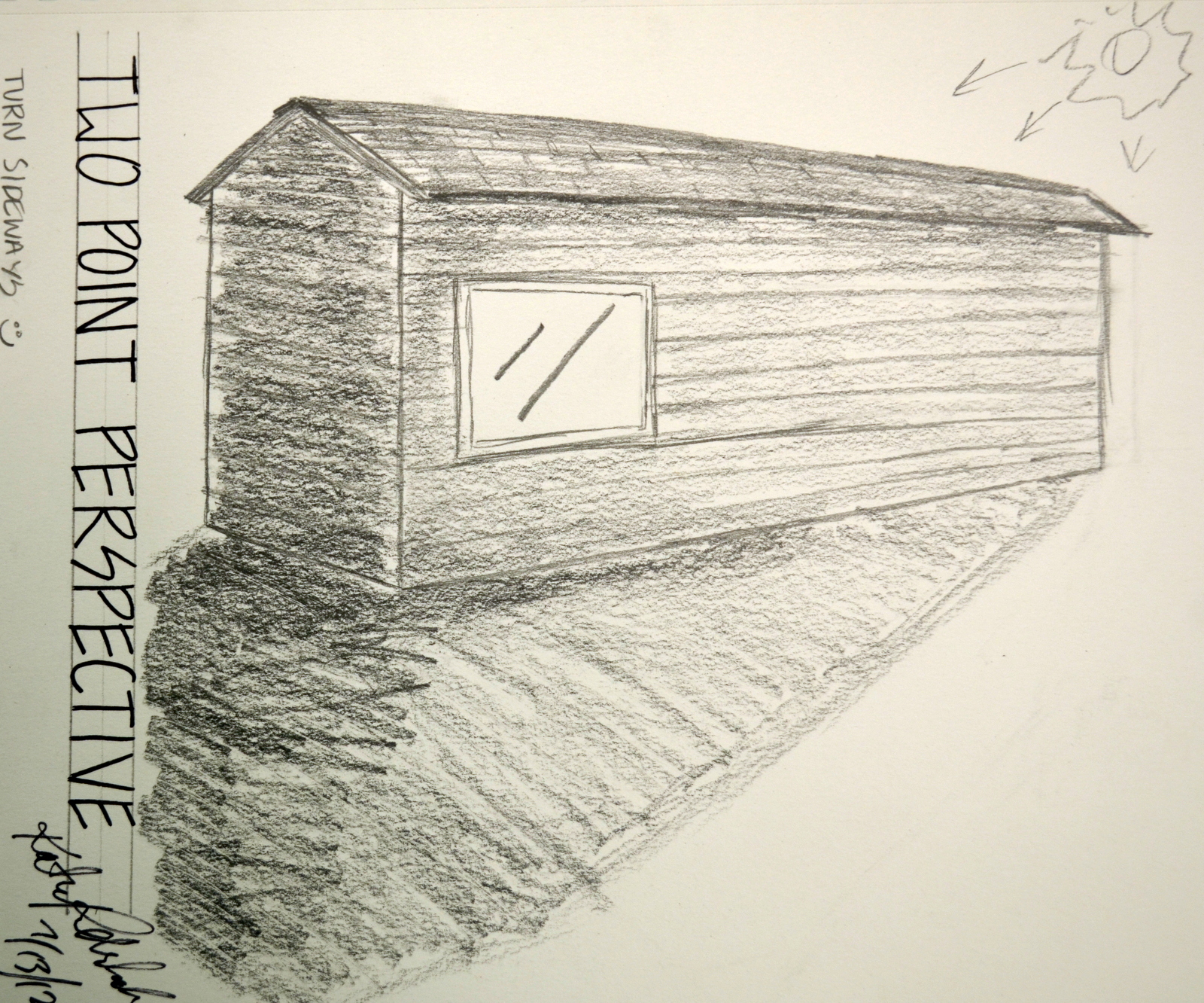
For my presentation of my model I showed my inspirational quotes, designer; Frank Lloyd Wright, and object analysis, parti's, concept models, floor plans, section, north and east sides, materials perspective views and shadow from 3 times during the day. The name of my final seat and shelter is called Rigid Flows due to the inspirational rigid lines of Frank Lloyd Wright's many designs, found objects; pine needle and the flows of the second inspiring object; water.  These posters are mainly to show my process through the entire design up until the final model and presentation boards.

I designed the seat and shelter prototype for outside the EMP in Seattle, Washington. The warm colors of the EMP structures and grays of the city will contrast with the popping blue,purple, and green tones of Rigid Flows. Rigid Flows incorporates both art and shelter/seating purposes in its structure. Granite and quartz are used to incorporate nature into the design. Using these rocks as seats are designed to keep the people of Seattle comfortable. I am from the Seattle area so I've experienced the Seattle culture and the native people in Seattle are very relaxed and down to earth in the city. You can meet some very interesting people in Seattle. For the most part they are even comfortable just sitting on the rocks against the shoreline, the curb of street and anything in between. The rocks are designed to me smooth and comfortable to sit on with some curvature to encompass any human size.
Also the inside of the structure is made for a handicap-able person to back up into and stay out the rain which Seattle is known for.

I chose to have a metal roof for my seat and shelter so that the sound of the rain hitting the roof would create a beat much to that as music. Seattle is well known for its music created my street musicians and talented musicians from the schools. Basically the seat and shelter will fit right into the day and night life of the cityscape and be in harmony with the city itself as a whole.

Friday, July 20, 2012

Final Model


This is the final model of my seat and shelter; RIGID FLOWS. It was inspired by Frank Lloyd Wright as well as natural objects such as pine needles and water. This particular photo was taken at noon in order to see the shade casting (more photos from different times to come soon). My seat and shelter is made primarily out of metal with up lighting in the ground and inhabits iridescent aspects in the design. The rigid lines and smooth surfaces are reminiscent of Frank Lloyd Wright designs. Also reminiscent of his designs are the organic aspects; the rocks and forms of the piece inspired by pine needles and water.

Sunday, July 15, 2012

Revised & Final Concept Model

 It's finally here! The final concept model! The first photo shows the front angle and the other photos are all different angles. It was fun to build all these models but I finally settled on this one as my final concept model. The next model(s) to come is seat and shade model. It took awhile to get to this point and settle on a design but I believe this was the best model I came up with that is reminiscent of Frank Lloyd Wright designs and inspired by. Enjoy! More to come! This was a great experience to make models out of plastic and metal. Being able to be in control and manipulate all the curves and twists was a thrill you can't replace as a designer.


2pt Perspective

To practice two point perspectives I found this old house that was about to be torn down in Viola Idaho. I drew this using graphite pencils of different line weights. Being able to practice the two point perspective was fun but it proved to be difficult. The angles and I just didn't seem to agree 100 % of the time. I guess I just need more practice.

Virtual Room Creation

First I drafted out the grid on paper for the room, then I added a layer of structural elements, furniture boxes, refined furniture & people, and then a final drafted drawing of everything all together. 
The next step I took was to scan in my final drawing into the computer and input digital materials for the textures and colors to create the look I wanted. I love the way it turned out and I am very pleased with the outcome. This was the first time I had done a hybrid drawing like this so it was great experience. If I had to do this all over then I would add beams to the ceiling and make a better hallway. Its a fun little self project you can do to keep practicing your skills as a design.

In the Corner

This was a sketch I did to practice my ability to use my pencil to help draft out a room. This one came out a lot better then the red building [one point perspective] that I did. I also practiced using shades and shadow in this one measuring everything to scale how I saw it. I chose to the brick walls and the windows in order to challenge myself to get all the lines correct. The windows are all blocked out so there was no natural light source coming into the room through that window. The carpet is very finely woven so all I really did was texture it through graphite.

3 best study models


Each of these were inspired by my 3 parti's and are my three favorite study models. I will use these for inspiration of my concept model and then again for my seat and shelter. Being able to create these concept models using different materials to work with was fun and helped me gain experience in model building. I had never worked with chip board or cereal boxes or metal before in my model building. I've only ever used form core, wire, foam blocks, lighting strands, etc. 
So basically this was a good step to take in my designing since I gained a lot of experience. 
The first study model was made out of a combination of chip board and cereal boxes and inspired by parti #3. The second model was made using chip board, cereal boxes, and metal - inspired by parti #2. The third model was inspired by parti #1 and is made of metal and plastic. 

Exterior 1pt

This exterior sketch done in colored pencil and black ink flair pen uses one point perspective. It was hard for me to do since I was not allowed to go closer (closed off for construction). I did this sketch to practice my ability to do one point perspectives. I definitely have room for improvement. I just have to keep on practicing. I used my pencil to take measurements - which is a useful skill to have in drawing. I haven't been using it for a long time only about 5 years off and on so I definitely need to keep practicing with it.

Frank Lloyd Wright Reminiscence


 The above picture was taken around three o'clock pm in high sunlight. The pine needles are the inspiration for a seat and shelter I have been designing that is reminiscent of Frank Lloyd Wright. Refer to the Frank Lloyd Wright poster posted a few weeks ago. I used quotes from Frank to inspire the seat and shelter (concept models to come soon for your viewing pleasure).


 After gathering/picking pine needles off the tree I did a complete object analysis of the needles. Being able to give the object my undivided attention to study it allowed me to come up with a bunch of concept sketches and eventually 3 parti's (see below).


At this stage I was able to incorporate water into my designs and narrow down my 100's of idea sketches into 3 final parti's. These three parti's will be used for the inspiration of my study models and from there I will chose 3 of my best and use them to inspire my concept model. 

Two Rooms

For this sketch I wanted to show the difference between the use of just lines and then the use of lines with shade and shadows. The first sketch on the left shows just lines while the one of the right shows the use of lines with shade and shadows. The first drawing was done using a black flair pen while the second drawing was done using black flair pen. I struggled to do this freehand with no rulers because I have shaky hands due to surgeries but I still think these turned out well. I emphasized the negative space in the first sketch and in the second sketch I emphasized shading and shadows.

The Fabulous Chair

This complete series of my chair in the dining hall at University of Idaho was to help me gain personal experience with different view points of this fabulous chair. I took the chair and did a perspective drawing, side, front, underneath, above, and pattern view of this chair. I practiced my measuring skills and rounding to a half inch. Being able to draw and sketch is a skill I feel designers should constantly be keeping up on hence all these sketches. I was also able to practice my measuring skills, which as a designer you constantly need to be on your toes about.

Napkin Art

"Napkin Sketch"

Since I ran out of paper I decided to draft out a floor plan and a perspective drawing of my new dorm room for everyone to see. It's freehand drawn to scale or close to it in a black ink flair pen. My dorm is located in McEachern Hall North on the Washington State University campus. By doing these drawings on a napkin I came across some obstacles, such as ink bleeding thus distorting the image I was trying to create. Writing on napkin material proved to be very difficult. This napkin was more of a paper towel type texture with lots of bumps and absorbancy. I tried several brands of napkins ranging from cloth to paper napkins. There are so many paper napkins out there in the world but I finally settled on the paper towel type napkin since it proved to bleed less than the ones I previously tried. Now that I have gotten the experience of napkin drawing under my belt my lines on flat paper have become steadier and more streamline.

Tuesday, July 3, 2012

Greek Pattern


I made a patter of 10 inches by 10 inches using manipulated Greek pictures representing the 5th Century BC. I chose to do a grid pattern of 2 by 2's and to change the directions of the photos to create a central point while making it asymmetrically balanced[few things that aren't actually symmetrical]. The color harmony palette I chose was triadic; its captivating and attention grasping. The below image chose the original images I cut out of different pictures and how I transformed and manipulated the images in Photoshop to create my color harmony.  

Monday, July 2, 2012

Frank Lloyd Wright Bio

One of my favorite interior designers / architect is Frank Lloyd Wright. Personally if I had to describe Frank's style of design I would say 'organic geometric.' The rigidness of his designs and his incorporation of shapes is what he is well known for. Using the elements and principles of design that I correctly identified in my Elements and Principles Posters [earlier post]  I was able to create a well thought out poster for Frank Lloyd Wright. I used an underlying grid to create the overall layout with varying protrusions; similar to his style of work. For example the text boxes start and end at different points on the page just like the lines in the stained glass art by Frank [left side]. It is also similar to the way the Falling Water house is built [see background]. The color scheme may be slightly dull in appearance which is something for improvement but other then that I believe it is spatially pleasing and informative.

Elements and Principles


Using the elements and principles of design I constructed two posters that represent each element and principle per Greek 5th Century. I searched through numerous books and websites in order to find all of these images and placed them accordingly onto the posters. Each element and principle is clearly defined with a supporting sentence and description of the image to go along with it.
If I had to change anything about my design it would be to use more color and really make the poster pop. I used an underlying grid to create order in the posters. One of the posters is done vertically while the other is done horizontally - the pieces fit better for each of the layouts in these forms.

Tri- Fruit

I call this piece Tri- Fruit since I did a value painting of three pieces of fruit; pear, apple and orange with flair pen ink. I mixed the appropriate shades in tints, tones and values  in order to show the scene I saw in front of me.  I captured the correct values and tones of each piece of fruit to a 'T.' After the paint had dried I sketched over the important lines for contour drawings in each piece of fruit to emphasis the lines I felt would be strong. Overall I feel successful with this piece and look forward to doing another just like it.

Stairway to Heaven


This was a shadow analysis I decided to do using a staircase and its railings. This sketch was done around 5:30 am near McEachern Hall, Pullman, WA. In the first sketch you will notice the subject matter and the shadows it's creating. The second sketch shows red lines indicating the figures that are creating shadows. The parallel and perpendicular red marks indicate what part of the shadow the line is coming from; either a parallel line or perpendicular line. Most of the lines in this case study were parallel lines as the sun was casting a short shadow on the railings.

Inverse Leaves

For this sketch I took a photo of a leafy stemmed plant and created the outline of the plant with light lines and continued to fill in the spaces I created minus the leafy part. This created an image of the shape of the subject matter with no detail to help with the identification of its origin. the positive and negative shape I created can now be interpreted as almost anything! I love it.

Getting into Shape

Using a black flair pen I created this contour sketch of a man running on the beach. The original photo is posted above for reference. I simplified the image into the basic essential lines using no shading what-so-ever. There is still room for improvement in my pen-men-ship and free hand drafted lettering.

Talking Trees

While on a stroll through campus I came across these two very different trees and decided to sketch them One bares leaves while the other has pine needles. I decided to do somewhat detailed sketches in graphite placing the trees next to each other on the same page. I focused on using semi- contour lines on the first tree [left] and using more detail on the second tree [right]. If I had had more time that day to sketch I believe I would have done a much better job.

Tissue Please

Using contour lines with gradation and values I drew a picture of my left hand holding a tissue. Since the tissue was white and smooth there wasn't much room for detail other than shading which I correctly visually identified and recorded in my sketch.


Lines

Using the main lines of different artists in the first four boxes I tried to duplicate their lines. Such artists include Picasso. In the fifth box I did my own sketch using what ever style of lines I wanted -- my own style of any object of my choosing. In this case I chose a safety pin where I used simple lines and shading for the pin and cross hatching for the shadow cast.


Hands Off


This blind contour drawing of my hand was challenging to do as is all blind contour drawings since well, they're blind. In my hand I was holding my promise ring and my necklace with the chain weaving around my fingers. Thankfully my hand doesn't look this way in real life. With practice and patience I will be able to improve my skill in blind contour drawings.


On the Palouse


Originally I traced a picture taken on the Palouse in Washington State. I then began to play around using my new gadget - the Wacom tablet. As I have never really used a Wacom tablet before I did a lot of trail and error in the process of redrawing this photo digitally.  I did however completely cover up the photo and create my own work of art. This is just the beginning of my growth with the Wacom tablet.

Pablo Picasso

Self practice blind contour drawing of an original drawing by Pablo Picasso. As a challenging element the image was done upside down. I guess anyone could be a version of Pablo Picasso. This was challenging for me due to the fact that I had to stop myself from looking at the paper. Blind contour drawings are fun yet challenging. Hopefully more to come.

Keys

The drawing above is a contour sketch of several keys on a ring. I did this as an exercise to teach myself contour lines and grasp the concept of contour. I still need more practice with contour lines and taking out detail. The sketch includes 7 keys in all. Total line about 15 minutes.